

The Challenge
LVL7 needed an identity that matched the kick of its 7-hydromitragynine products — strong, playful, and impossible to ignore. As a newcomer in the high-potency space, the brand had to stand out with personality and connect with experienced users who want something that works and feels fresh. The goal was to create a visual system that’s bold, flexible for future lines, and easy to spot in a cluttered market — all without losing that fun, no-BS attitude.
The Solution
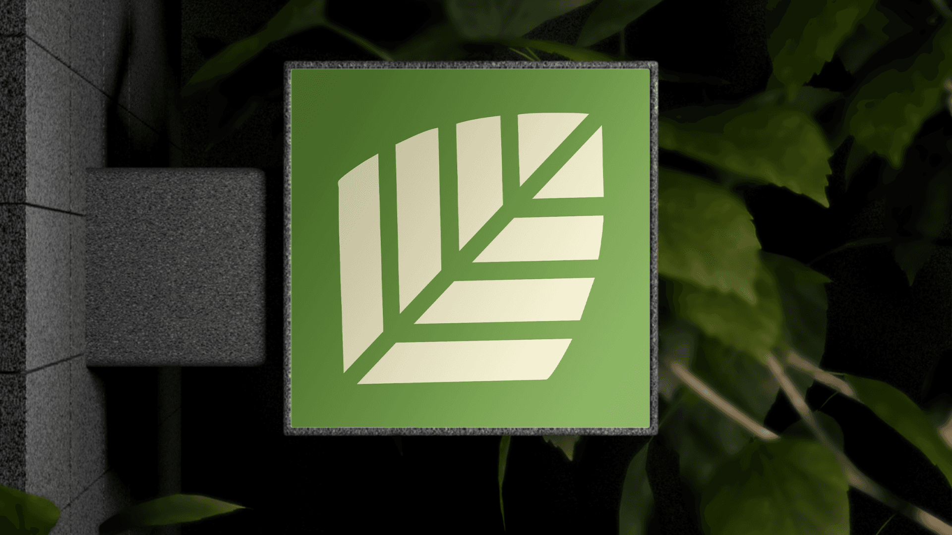
I created a bold and flexible identity system that captures LVL7’s high-energy. The logo pairs a clean, modern wordmark with a punchy icon that hints at the brand’s strength and attitude — without getting too serious about it.
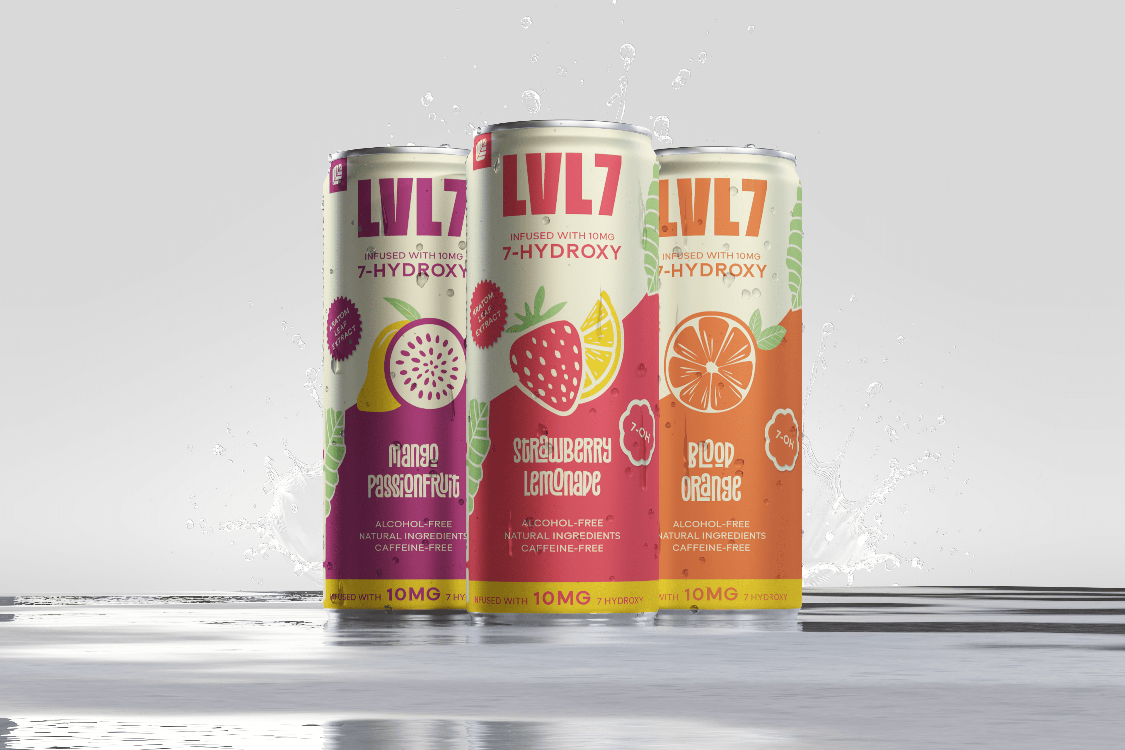
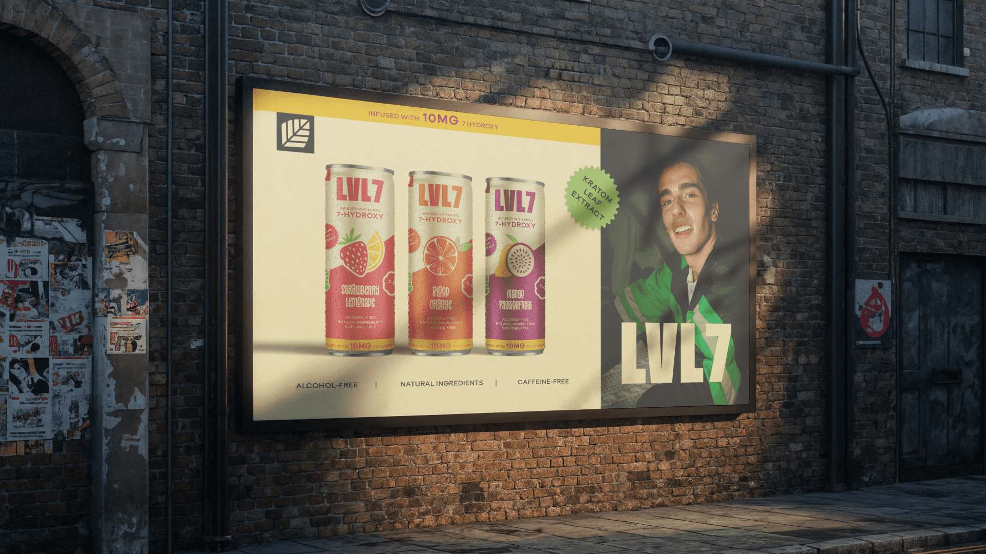
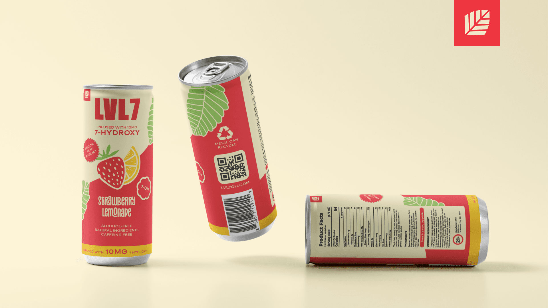
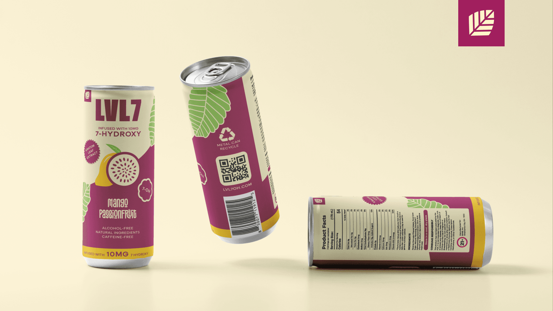
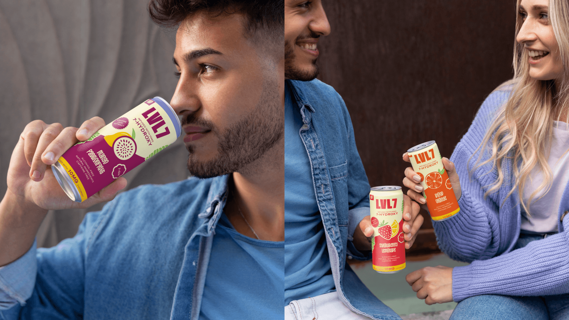
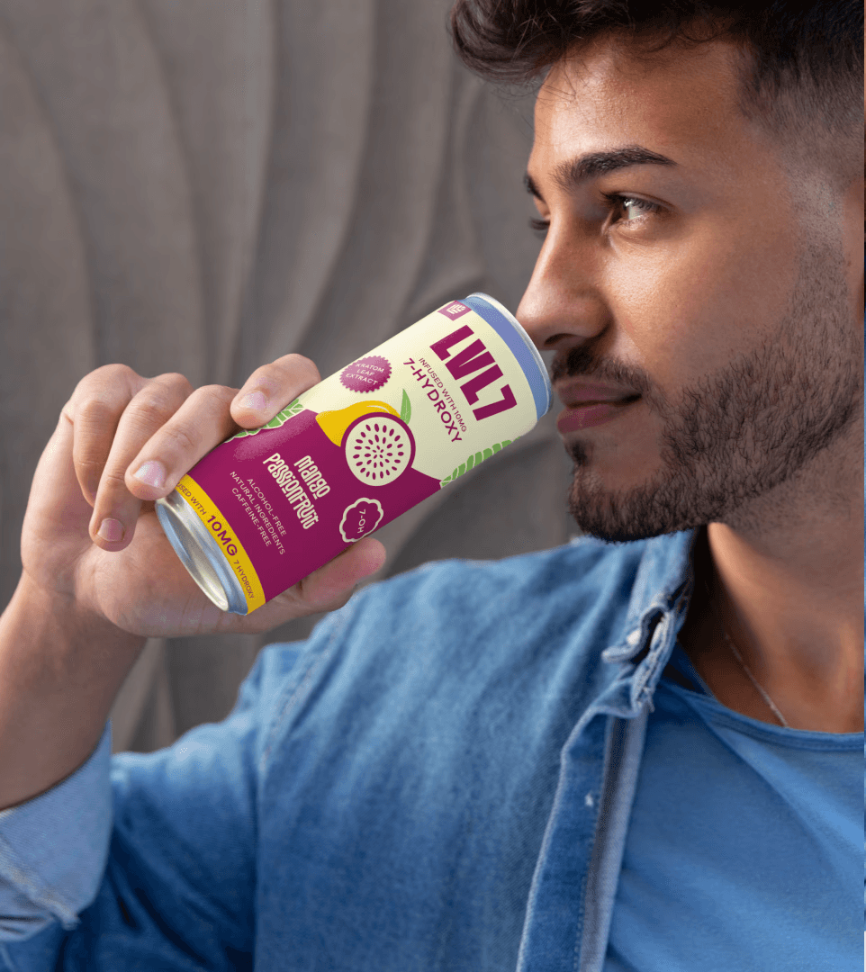
For the packaging, I designed eye-catching cans for three unique flavors, making sure each one stands out while still feeling part of the same crew. To keep things consistent as the brand grows, I also delivered a handy style sheet for future rollouts.


My Contributions
Logo Design & Visual Identity: Crafted a sharp, high-end logo and cohesive design system that elevates the LVL7 brand.
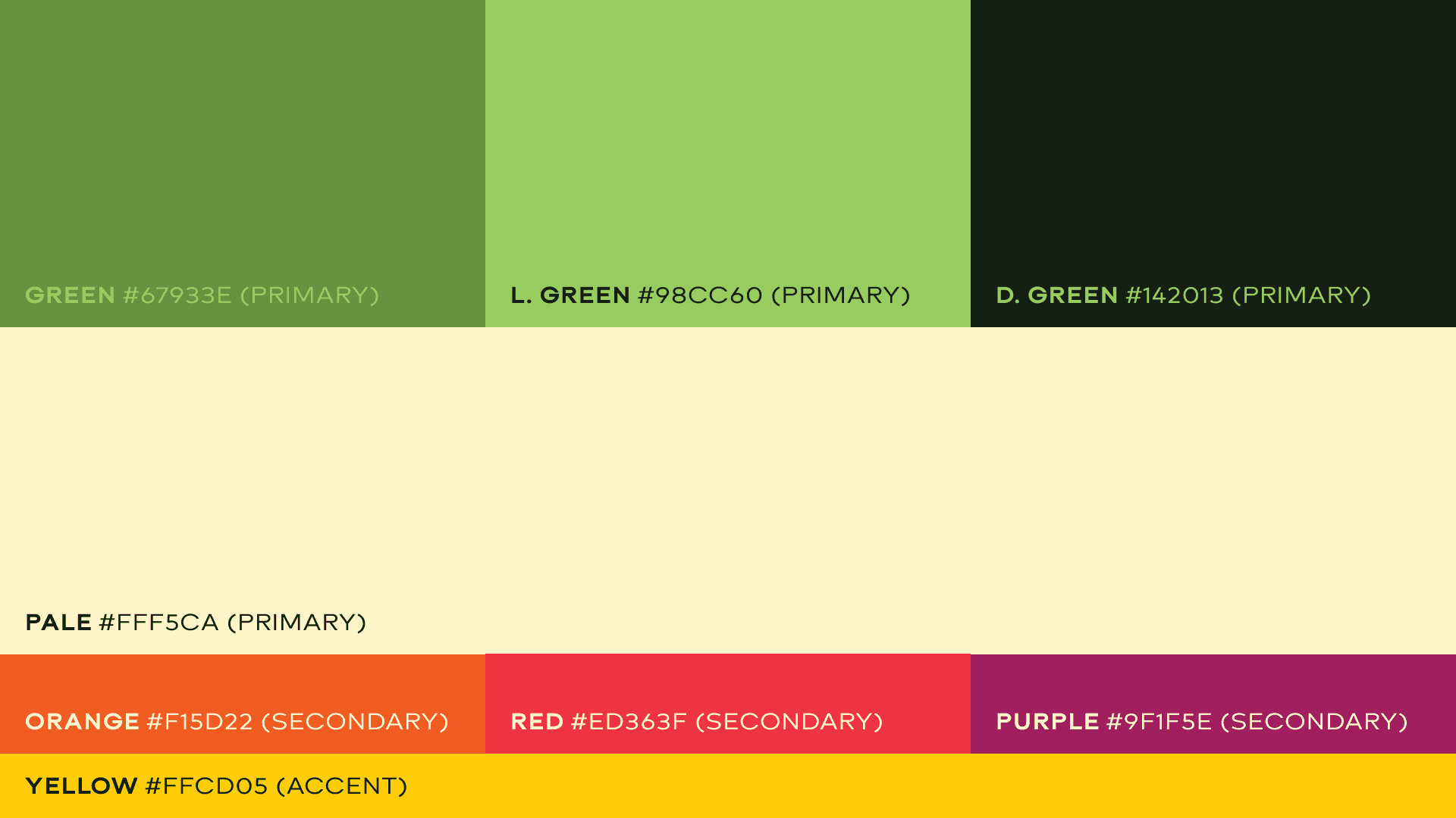
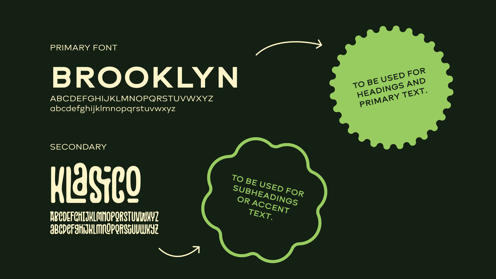
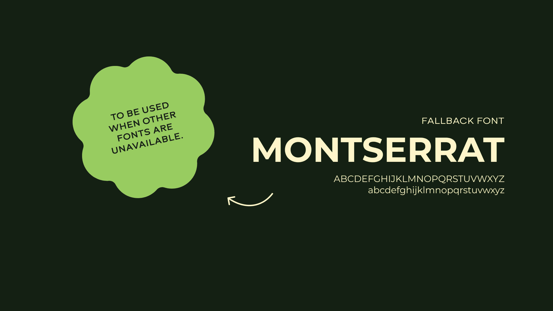
Color & Typography System: Developed a bold yet sophisticated palette and scalable typographic hierarchy to ensure consistency across all applications.
Packaging Design: Designed striking cans for three unique flavors, balancing visual differentiation with brand cohesion.
Brand Style Guide: Built a style sheet detailing core brand elements to enable consistent rollout across future product lines.

LVL7’s new identity was designed to capture the brand’s bold, playful spirit. The brief called for more than just a good-looking brand — it needed a system that felt vibrant, confident, and ready to stand out in a sea of sameness.
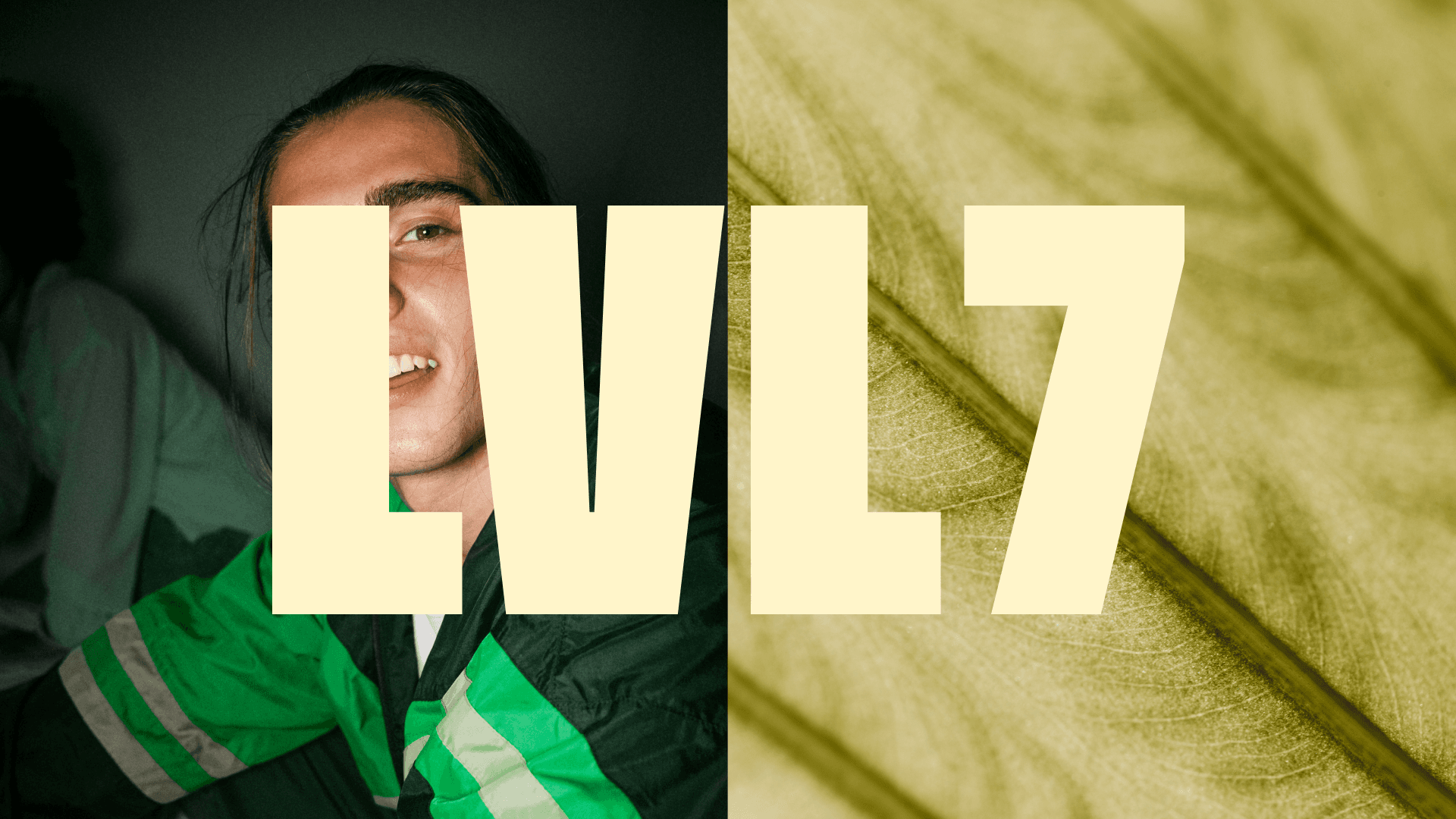
The result? A fresh and flexible visual identity with attitude. We kicked things off with a punchy logo system that mixes a clean, modern wordmark with a simple, energetic icon — a combo that reflects LVL7’s quality and edge, without taking itself too seriously.
From there, I developed a rich color palette of deep greens and vibrant accents, paired with contemporary typography that creates a sense of premium quality and visual hierarchy.
Every element of the brand was designed to work seamlessly together: from striking packaging for three signature drink flavors, to a style guide that ensures consistency across all future product launches and touchpoints.
This robust system gives LVL7 a strong, recognizable presence that translates across physical and digital spaces — from store shelves to social media. Whether on a can design, a website banner, or merchandising for lifestyle activations, the identity positions LVL7 as the go-to choice for high-potency users seeking a premium experience.